 Hi, I'm Peter Rose, Founder of Longwood Currency Trading, and welcome to LCT Blog Post 11/04/21 — How To Identify FOREX Price Profit Targets, and is probably one of the more significant research pieces I’ve done, and presents more depth and conclusions than I cover in the video.
Determining profit targets can be done by either examining current price action structure, or through the more involved process of price momentum analysis.
Because momentum analysis is more appropriate for short term trading, and really not that well known or understood, I want to discuss structure analysis as that is the more commonly used approach for identifying potential profit targets on all time frame levels.
If you have an interest in learning more about price momentum analysis, the following videos I've done may be of interest to you:
Price action structure is normally defined as an area where price has stopped moving in a particular direction, may chatter briefly at that level, and then undergo a significant reversal — significant in relationship to the current time frame chart used. This event is considered to be 'stronger' if that 'stopping area', referred to as a 'congestion area', is duplicated several times in past price action.
Note that congestion areas don't just magically happen. Rather, congestion areas are the result of the beginning or completion of some large institution fulfilling customer orders at that level.
Because these congestion areas indicate a change in order flow, they make great approximations of how far price may run before either running into congestion, or experiencing reversal.
The longer term that you choose to trade over, the more congestion data points you should examine to determine the viability of the profit targets you are selecting. A shorter term trader must then only have to consider congestion areas near term to current price action, right?
Wrong....
If you're trading on a 5 minute time frame, for example, and only considering a few congestion areas created on the 1 hour, or even 4 hour chart, you may be exposing your position to enormous risk.
Take a look at the following GBP/USD Weekly chart which runs from approximately 08/30/2006 to 10/30/2021 with approximate maximum price of around 2.1024 to a minimum price of 1.1854, a spread of 9,170 pips.
For this discussion, I want to focus on just 2 major areas to the right of the first vertical red line, bound by that line over to the third vertical red line.
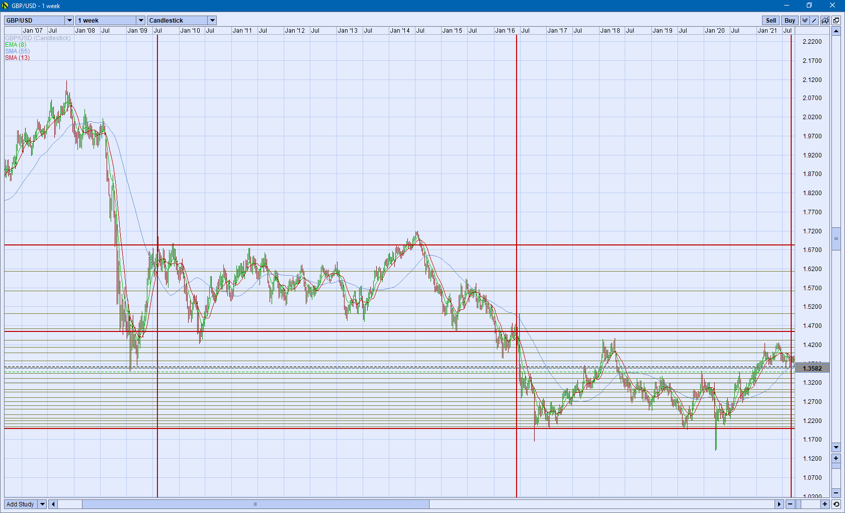
GBP/USD Weekly 08/30/2006 to 10/30/2021
Between the first vertical red line and the second vertical red line, running from approximately 06/30/2009 to 06/30/2016: price action is above the middle horizontal red line with a high of approximately 1.6837 to a low of 1.4563, a spread of 2,274 pips.
Correspondingly, between the second vertical red line and the third vertical red line, running from approximately 06/30/2016 to 10/31/2021: price action is below the middle horizontal red line with a high of approximately 1.4308 to a low of 1.1990, a spread of 2,318 pips.
Of immediate interest is that both of these price action areas not only average about 6 years, but over that time, price has traded over approximately the same 2,300 pip range.
Now, granted, the first 2,300 pip range is above the middle horizontal red line, whereas the second is below it. But, to me, anyway: that's really, really interesting.
Having said all of the above, the caveat here is that: all I did was take the weekly chart, and 'eye-ball' all of those data points. It would be interesting to run mathematical statistical scatter, standard deviation, etc. analysis against all that data.
However, none of that is really relevant to the thrust of my current discussion and analysis. Let's take a look at the practical side to all of this stuff.
Let's say you're trading the 5 minute, or even hourly, chart and are looking at a potential long trade opportunity with an approximate 40 pip profit target at 1.3000. You've drawn daily support and resistance lines on your chart and both your entry point and that 1.3000 target are significantly above the nearest line. You thus assume your profit target of 1.3000 to be viable with no significant resistance level that could interfere with price reaching 1.3000.
You take the trade, it moves in your favor for awhile, but then reverses unexpectedly such that your position is now at a 20 pip loss, though you're fine with the 30 pip stop you had placed on the trade.
Then price turns and heads back up to a 25 pip positive gain, though it reverses again to a 25 pip loss where it staggers, and then races back up to a 25 pip gain again. You feel you may just be in a temporary chop, but don't want to lose your position to one of these reversals as it appears that even though you had set your profit target at 1.3000, that was based on what you now think may be a weak structure level with far more upside potential than you had first thought.
Maybe you need to adjust your thinking to a 60 pip potential profit target.... Of course, if you do that, then you need to rethink your stop in order to.... are you ready for this? You're thinking you need to expand that stop now to 60 pips to give that price room to breathe.
Yeah, that makes great sense because you're still thinking that all that shit about 1 to 1 risk to reward that someone blew up your ass makes great sense here. Sure it does. Sure it does....
I've covered how bad this type of thinking is in many of my videos, and so I won't go into it here. But the thrust is: what happens if price spikes down, and takes you out for a 60 pip loss? Well, if you've been trading successfully for 10 or 15 pip gains and then take a 60 pip hit, your account is now probably considerably underwater. Don't 'expand your stop' for any reason.
The point here is not so much the dangers of stop expansion, but rather: why, after the initial analysis indicated a very viable profit target at 1.3000 for a 40 pip gain, and then further analysis revealed a potential of 1.3020, why didn't price even make it to 1.3000?
The solution, and something you simply have to do every now and then, is to pull up the weekly chart and look at where current price is in relationship to one of those support/resistance lines. You may be surprised to see that price is at one of those major, 'big dog' zones, zones that could be literally hundreds of pips deep.
Take a look at that example GBP/USD chart again before you charge off to read my next blog post or watch the companion video listed below:
GBP/USD Weekly 08/30/2006 to 10/30/2021
As you're looking at this chart, please write down on a piece of paper — that you'll actually execute later and not toss in the trash — the importance of consulting the weekly chart structural price boundary zones in relationship to your current trading analysis before entering a position regardless of whatever any other analysis you've done may indicate.
Companion VideoHere's that companion video of the same title: How To Identify FOREX Price Profit Targets I mentioned at the start of this post that puts all of this together from a different view point.
Thanks for taking your time to read this post,
Peter
p.s. For more of my thoughts on trading in the FOREX foreign currency market, check out my YouTube channel for Longwood Currency Trading